Redesigning the Admissions Journey for Undergraduate Students
Service
UX Consultancy
Client
Tec de Monterrey
Agency
Usaria, 2024
Agency
Usaria, 2024
Client
Tec de Monterrey
Service
UX Consultancy
A private university in Latin America was experiencing a sharp drop in undergraduate application rates after years of consistent demand. Despite implementing several changes to its admissions website, conversion rates continued to decline.
The internal team suspected a disconnect between the platform’s content and the needs of its target audience—primarily prospective students and their parents.
The Challenge
The business team needed to understand what was driving the decline in applications and how to reposition their digital experience to better support both informational and emotional needs. This required going beyond usability improvements and addressing the fundamental misalignment between the university’s messaging and the real decision-making processes of their audience.
As the lead consultant on this project, I was responsible for understanding the business context and designing the UX roadmap accordingly. I oversaw the end-to-end experience strategy, including the redesign of the website’s information architecture to better support decision-making moments. I also led the facilitation of co-creation workshops with marketing and admissions stakeholders, helping align institutional priorities with the needs of prospective students and their families.
Throughout the engagement, I mentored the internal team and collaborated closely with a junior UX designer and a UI designer, ensuring consistency across research, strategy, and visual execution.
Timeline
The engagement spanned twelve weeks, from discovery and stakeholder interviews to research execution, insight synthesis, co-creation workshops, and final prototyping.
Research statement and goals
To uncover how prospective students and their parents experience the admissions journey online and identify gaps in the communication, structure, and value proposition of the website.
Success criteria
Identify barriers to engagement and conversion on the website.
Understand student and parent motivations, expectations, and decision dynamics.
Generate actionable insights to inform content restructuring and design strategy.
Research methodology
We conducted in-depth interviews with high school students actively exploring university options and who had a stated interest in applying to this institution. We also interviewed parents whose children were in the same stage of exploration and showed affinity for the university. Participants were recruited from key states across Mexico to ensure national representation.
In both cases, we used contextual walkthroughs of the current admissions website, applying the think-aloud protocol to surface emotional reactions, information needs, and usability issues. Additionally, we carried out stakeholder interviews to align institutional goals with gaps identified in the user experience
Recruitment criteria and process
Participants were recruited based on their active involvement in the university decision process—students in their final year of high school and parents who were either financial decision-makers or information navigators. The sample was diverse in socioeconomic status and geographic region.
Sharing and activation
Findings were presented through an insight-led co-creation workshop with business and design stakeholders. Together we redefined the value proposition for each user type, prioritized opportunity areas, and co-designed a new information structure.
A clickable prototype was delivered to the internal team to guide implementation.
Approach
Outputs & deliverables
Insight report structured around personas and decision-making moments.
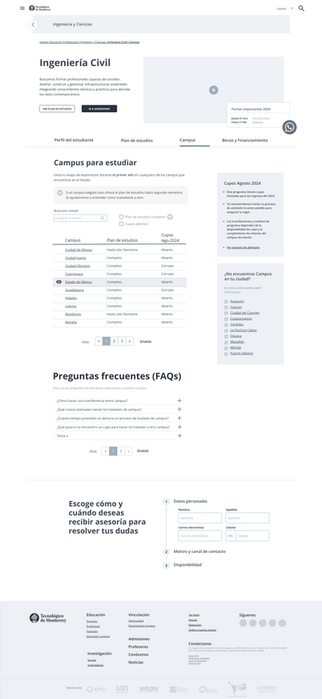
Redesigned information architecture and content strategy focused on parent and student needs.
Journey map highlighting the parallel roles of students and parents in the admissions process.
Clickable prototype incorporating revised structure, content blocks, and CTAs aligned with both audiences.
O3
The site failed to support decision-making for either audience
Participants struggled to locate and understand academic offerings. The website’s structure, language, and lack of strategic content made it difficult for both students and parents to feel confident in the decision to apply.
O2
Parents are the decision facilitators—but were blocked by the interface
While students cared about long-term outcomes, it was parents who handled the actual admissions process. However, none of the parents interviewed were able to find clear instructions on how to begin or complete an application. Navigation and labeling posed a serious barrier.
O1
Students prioritize future connections, not academic details.
Most students were not focused on reviewing academic curricula. Instead, they were looking for a university that could help them build a strong professional network for future employment or entrepreneurship. This aspirational driver was not reflected in the site’s messaging or structure.
Key findings
Business Value
Impact
Following implementation, the admissions team observed a 75% increase in applications in the subsequent quarter. Beyond performance metrics, the internal teams gained stronger alignment around user needs and began integrating UX research practices into other departments.
Reflections
This project reinforced the importance of designing not just for usability, but for emotional alignment and stakeholder coherence. The most transformative shift came from understanding that parents and students do not share the same goals, timelines, or triggers. Designing for both—without friction—was the key to restoring trust and relevance in the digital experience.


